This is not your grandmother’s website design trend, Cupcake. Brutalism is taking the web design industry by storm, and all it is offering is “all effect, all the time.”
Gone are the days when even the most callous of customers were wowed by a splash of color or the inclusion of a looped video clip on a company’s homepage. We’re heading for 2020 at breakneck speeds, and some of our audiences are hard. That’s why one of the newest and most effective trends in web design is aimed at grabbing the audience’s attention with piercing images and off-putting design.
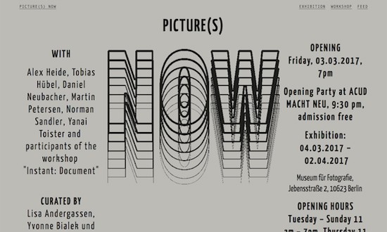
The intent of the Brutalism design movement is to use unexpected and uncomfortable graphic design to stand out from the sea of web pages currently available on the internet. We’ve reached a point of saturation and of desensitization with stock photographs and the entire style that stock photographs represent. A certain demographic of customers can only truly be effectively reached by finding an immediate and impactful way to stand out from the crowd and to announce your company’s individual flavor.
Although Brutalism has risen to popularity on the wings of its ability to emphasize the bold over the beautiful, it is not the web design equivalent of a radio shock jock’s raunchy bit or of the gore quotient in the newest slaughterhouse film. Brutalism means embracing the raw and the unconventional in favor of the quiet, clean, calm, and safe. It doesn’t mean exploiting the unacceptably vulgar or disturbing, but rather leveraging the “ugly” and “flawed” to display the beauty that can be found in harnessing natural chaos.
More than one writer has described the movement as being “based on the architecture from the concrete era of the 1950s to the 1970s”, and that’s a good way to think about it. Imagine a cold, rectangular, gray, concrete tenement building. That’s the spirit of brutalism. It isn’t pretty, and it doesn’t try to be. It is functional and harsh and sometimes stark in style. It uses the unexpected aspect of this approach, however to intrigue and invite the customer to explore. Perhaps you have customers who are not searching for yet another jungle of smiling model faces and brightly colored panoramas. Your customers may find simple, stand-alone geometric divisions and basic text fonts more attention-grabbing.
The Brutalism concept goes deeper in web design than just the surface appearance of the homepage or landing page, though. More purposeful Brutalism seeps into the build of the website itself, challenging what web designers have come to know, accept, and teach as best design practices. It embraces simplicity and an appreciation for basic structures and construction, rather than defaulting to the established idea that complexity is, in and of its own right, inherently superior.
If you’re wondering if I’m suggesting that every company needs to dump its effective, appealing, polished, and warm design and fling themselves full force at the feet of take-no-prisoners Brutalist design, I am not. The rise of Brutalism does not signal an all encompassing revolution meant to salt the earth around the ruins of aesthetically pleasing graphic design. Instead, it is meant to remind both web designers and web users as a whole that design is a choice, and it is meant to act as an individualized expression of a company and it’s clients.
Consider yourselves and consider your audience. You know your own realm. Perhaps, though, if the clean, complex, vibrant look that has dominated web design over the past number of years has never really been indicative of your company’s spirit or message, you might be able to benefit from a change that is. And sometimes, even when we know who we are and who our customers are, we’re still not quite sure how to accurately represent that. That’s alright, too; that’s what web designers are for.
Take this knowledge with you as you venture back into the web now. Focus a keen eye on the presentation of the websites you see, and ask yourself what they say about that web owner. If you’ve been mistaking “plain” and “ugly” for “unprofessional” or “incomplete”, look again. Just because something is a little raw and unpolished doesn’t mean that it doesn’t contain all of the intention in the world. Just because something looks old and functional and basic doesn’t mean it isn’t the product of one of the hottest new artistic web design trends to hit the market.


