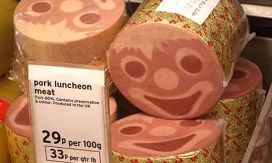
It was in the lunch line. And trauma had a name: “Mystery Meat”. Was it beef? Maybe. Chicken? Doesn’t taste like chicken and EVEYRTHING tastes like chicken. Pork? Sure…
As unappetizing as mystery meat in the school cafeteria can be, it isn’t much more appealing in web design. In fact, the design industry article that originally coined the phrase “Mystery Meat Navigation” was entitled Web Pages That Suck. Simply, it’s a warning to designers and their customers to avoid it whenever possible.
What is “Mystery Meat Navigation”?
“Mystery Meat Navigation” is the term used for using images or icons as the clickable links for site destinations without labeling them clearly. The user is only able to see the title or destination of the link once they scroll over or click on the image or icon. In worse cases, the image or link may not even be recognizable as clickable unless the user mouses directly over top of it.
The least harmful way to use “Mystery Meat” is by employing relevant and obvious images that no one could mistake as leading to the links they’re trying to reach. If your website is “Bob’s Shoe and Sock Sales”, then it behoove you to use a picture of a sock and/or a shoe to lead your customers to those specific pages.
The absolute worst usage of “Mystery Meat Navigation” is when multiple links are imbedded in a single image, it’s not clearly defined where the links are located, or they are even there at all! For instance: if you’re the owner of “Joe’s Automotive Repair”, you don’t want your landing page to feature a picture of a car with no text or demarcation. Then expect the prospective customer to scroll over all of the different parts of the car until they find the correct part or problem.
Reasons being, you’re assuming that they’ll figure out that they need to scroll over the image, if they even have that capability (mousing over specific locations to find imbedded links can be challenging on some tablets and cell phones). Also, you’re assuming your customer is going to be able to understand immediately which part of the car you’ve placed the link.
Perhaps the most emphasized point in web design and in online marketing right now is the user friendliness and ease of use. Web design is constantly and consciously evolving to eliminate the customer effort and time required to visit a website.
Keeping the customer on the page and creating the perception of natural use is the key to online success.
When customers are forced to search a website for the relevant links – or when they are given the impression they have to put forth any mental or digital effort – They become frustrated and begin to see their relationship with the company that owns the page as an adversarial one.
You never want your customers to believe you’re making things harder on them or using up too much of their time. Instead, give the impression you’re saving them time and making their tasks easier.
“Mystery Meat Navigation”, even in its best forms, can give the customer the impression of “game playing”. Immediately sowing a seed of annoyance and distrust. Even in the example of the aforementioned sock and shoe sales; the user may feel since the link does not appear until they hover over the sock or shoe is rooted trickery.
Conversely, you always want to leave your potential customers with the impression your business is coming from a place of honesty and transparency.
While the sock and shoe images seem pretty self-explanatory, very few websites are only going to be populated with links that are this self-explanatory through imagery. Even Bob’s shoe and sock page should contain an “About Us” and a “Contact Us” page.
Point being, leave it in the hands of the customer to have to figure things out for themselves.
“Mystery Meat Navigation” can involve some cool coding mechanics, and it may sometimes seem like the flashier, more sophisticated option. However, we cannot get so caught up in the urge to make our websites look fancy that we forget that the user experience is actually the primary goal and the only one that matters.
For more information about “Mystery Meat Navigation” and what may be most effective for you and your business, please contact JEG DESIGN INC today!


