Web design plays a crucial part in turning your traffic into profit. The number of web visitors that convert into customers or potential customers is directly proportional to money in the bank. First impressions are last impressions. The web does not give second chances. To remain competitive, it is absolutely essential to have a web design optimized for conversions.
You need a website that enhances user experience and compels the visitor to take a predetermined action in accordance with your business goals. Such a website can be a growth engine that will visibly drive leads, sales, and engagement.
Without conversions, your website is just a brochure. A visitor who leaves your website without taking any action is comparable to a brochure tossed in the bin. Do not let that happen to your website. Your website is not a brochure, it’s a virtual shop front. Invest your money in web design aimed at conversions, instead of channeling money into ads for increasing traffic.
What Is Website Conversion?
A website conversion is when a visitor to your website completes a predetermined action on your website, like signing up for a newsletter or buying a product. If you have an e-commerce website that gets 5000 visitors a month but only 500 of them buy your product, your conversion rate is 10%. The process of finding ways to increase your conversion is called conversion rate optimization (CRO).
Conversions are unique to every website depending on the business goals of the website. It could be simple commitments like filling up a form or needle-moving macro conversions that have a direct impact on your revenue, like buying a product.
The following are common conversion actions:
- Signing up for a newsletter
- Sharing content on social media
- Clicking a certain “Call-to-Action” button
- Form submission
- Downloading a resource
- Calling a number
- Buying a product – the ultimate conversion
A visitor who does any of the above would be considered “converted”.
Developing an effective conversion strategy is key to increasing sales. You don’t need to invest in customer acquisition. The customer has reached your website. You just have to keep them there long enough to convince them to take action. There are a multitude of tactics that can help increase your conversion rate.
Here are some CRO tips that can help you make the most of the traffic you already have:
Set Up A Sales Funnel
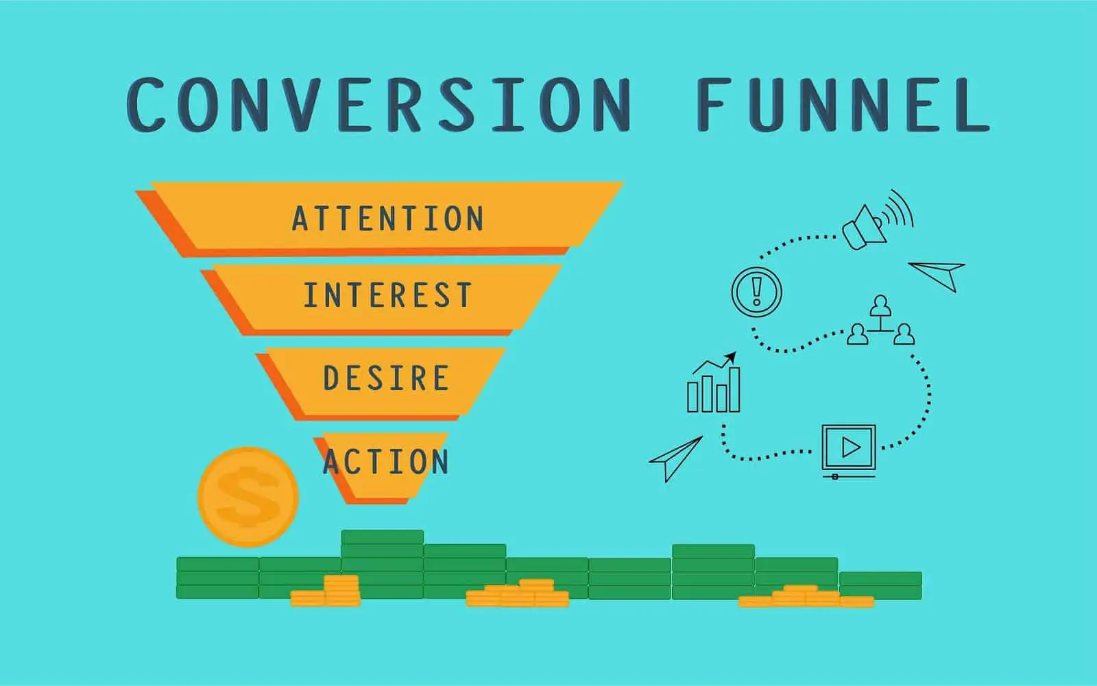
You cannot ask nor expect a visitor who landed on your webpage to immediately take an action. There is a method to this madness and that is the sales funnel. A sales funnel helps improve conversions because the visitor has moved through stages that are strategized to convince them to stay and act. The AIDA model is a proven marketing framework for converting visitors to customers:
Attention: Attract the customer with a neat web design. Grab attention and avoid distractions on your page.
Interest: Pique interest by telling the visitor you have an answer to their needs. Establish a brand identity.
Desire: Convince customers that they want the solution you provide. Here you try to create an emotional response. Show videos and customer testimonials.
Action: Lead customers towards taking an action. A prominent clear and uncomplicated call to action.
You can use CRM software to better track and plan customer interactions to make the entire sales funnel more intentional. A sales dashboard can help you visualize and show exact numbers at each point in the sales funnel, helping you focus on your problem areas.

Add Images
The internet is a visual, image-centric medium. Adding an image to your web page can considerably increase conversions. An image helps engage visitors and can help break up content nicely. Too many images can make your web page seem cluttered, and images of people can humanize your web page.
To sell anything, you need to play to people’s emotions. Using a positive image brings out positive emotions, which can be a powerful leverage when you are trying to sell something. Choose photos intelligently. They should be high resolution, but try to lower the file size without affecting quality. Images with bigger sizes take time to load and studies have shown that even a one-second delay in page response can reduce your conversion rate by 7%.
Simplicity is Key
A fast and simple web experience is what your customer wants. Here are a few points that you need to ensure for a first-class user experience:
- Seamless navigation. Make sure your website is easy to navigate and a visitor can easily go where they want.
- Use easy-to-understand language. Fancy, complicated jargon is not for the layman. Use powerful keywords that appeal to human emotions. Less is more.
- Remove distractions. For example, hide the menu when the visitor begins to scroll down the page. Remove anything that is unnecessarily drawing attention away from your business goals.
- Faster load times. A few extra seconds can make a huge difference in your ability to engage visitors.
- Forms should have as few fields as possible. Data from a study has shown that as the number of form fields increases, conversion rates decrease.
- Use whitespace. This makes for a clutter-free experience. Too many images and text can distract a visitor and increase your bounce rate.
- Live chat. Visitors can get their questions answered immediately. A confused user is unlikely to become a customer. Customer service platforms like live chat add the human touch while helping visitors with their questions.
This webpage for automated call distribution has a form with a few fields, a live chat, an ideal amount of white space, images of people, a good combination of fonts, and no distracting banners or big menus. This is a good example of simple, inviting web design. What’s more, their content strategy follows the AIDA model.
Mobile-friendly Web Design
Mobile internet is the present and the future. Mobile usage has exceeded desktop usage as of 5 years ago. Your websites need to be designed for mobile use if you want to stick around in the digital age at all. If your websites aren’t mobile-friendly, they also fall in search engine rankings.
Avoid using Flash in your web design. It is outdated technology and is not supported by mobile devices. If you do not have a mobile version of your website that caters to a smaller screen, you need to get one now!

A Clear Call-to-Action
At this point, you have engaged the visitor long enough to finally convert them. Now you need to change the tone and influence urgency. The biggest component of conversion is the call-to-action (CTA). Maybe you’re using newsletter subscriptions to turn a visitor into a paying customer – you need to have call-to-action options throughout your website and especially your landing pages.
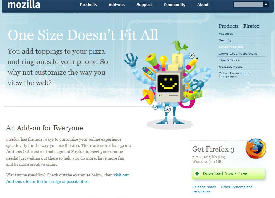
The CTA(s) need to be clear, accessible, and compelling. It shouldn’t be a boring, run of the mill hyperlink but an obvious, bright, and inviting button that begs to be clicked. Mozilla changed their call-to-action from “Try Firefox 3” to “Download Now – Free”. The latter helped increase downloads of their popular Firefox browser because it is a stronger call-to-action.
A/B Testing
CRO is meaningless without continuous testing of the changes you make, as per the points above. Audit your web design by having two versions of the webpage. Send half your visitors to webpage A and the other half to webpage B. Compare the conversion rates of both web pages and choose the one that has the higher rate. Test again with another web design feature.
Just as business call recording is essential for quality assurance of customer service call centers, A/B testing is necessary for quality assurance of your website’s performance. By comparing the performance of web pages with certain features that differ, you can obtain a conversion-optimized web design through trial and error. Knowing which web design feature works best can help you in future decisions for emails or new web pages.
Investments in UI/UX for your web design, as well as in user research and customer experience analytics for web performance, will give you strong returns. Your digital strategy is wholly dependent on your conversions. While it may be a small percentage of your traffic, even a small increase in conversion rate can boost revenue.
Incremental increases in the number of people who convert can deliver substantial results when compared to bigger traffic increases. A visually appealing, clutter-free and mobile-friendly website can help you grow tremendously and do wonders for your digital presence. A conversion-optimized web design will augment your brand’s online visibility, increase conversions, and ensure that your traffic culminates into revenue.
Bio: Richard Conn – RingCentral US
 Richard Conn is the Senior Director, Search Marketing for RingCentral, a global leader in unified communications and small business phone system provider.
He is passionate about connecting businesses and customers and has experience working with Fortune 500 companies such as Google, Experian, Target, Nordstrom, Kayak, Hilton, and Kia. Richard has written for sites such as Cincopa and Harver.


