


It’s nearing midnight on a Tuesday and the clock is running out. You have an appointment to pitch your new business idea.
It’s nearing midnight on a Tuesday and the clock is running out. You have an appointment to pitch your new business idea to potential investors at nine o’clock tomorrow morning, and your Excel slide deck is, quite frankly, uninspiring. Not only is it kind of boring, it’s also difficult to follow, and the main points are lost in the shuffle.
What do you do?
1. Panic and fall asleep
2. Re-design your slide deck into awesomeness using visual hierarchy rules
If you chose number one, you may want to reconsider your options.
If you chose number two, congratulations! You’re about to find out how to do it.
Why Visual Hierarchy Works
In your slide deck as it has been created, one of the main faults is that the important points, the actionable information, the takeaways, are all badly defined. It isn’t that the information isn’t there. It’s that it’s impossible to make out what is important and what isn’t, because everything is delivered as a one-note design.
It’s a visual monotone, stylistically speaking.

Image: Canva
Visual hierarchy is the ideal way to fix that problem. If you’re pitching a business idea to investors, it’s inevitable that there will be some information that you want them to focus on, and some that is a little less important, but still needs to be included.
Visual hierarchy is a way of pointing an arrow at the important stuff.
You could also include a pointing arrow, if you wanted, but the ten rules that are about to follow are a little more subtle.
Size Matters
Picture one of your slides. There are three pieces of information on it. Two are rendered in twelve point font, and the third is in fifty point font. Even if that third piece is last on the page, your audience is still predisposed to look at it first.
It’s the biggest. It must be the most important.
This tendency can be played with in order to assign importance where it belongs. Mix up your sizes and make sure that the high notes are emphasized with a larger font.
Numbering or Lettering
This is a very straightforward way to assign hierarchy to information. And precisely because it is so straightforward, and a little overused, it should be used sparingly and with caution.
But that doesn’t mean it shouldn’t be used at all.
Much like bullet points, a short list using numbers or letters to designate each individual item can help to set those items aside from the rest of the slide.
Color Association
Your audience also has a tendency to group things of a certain color together, linking them to each other even if they aren’t presented in the same area.
Color is a key part of any design, and it can definitely be used to assign hierarchy. Use the same color or at least the same color family to combine information that should be linked.
It’s suggested that you have at least one or two sets of colors:
• Create a color palette to use for hierarchy within the slide deck itself.
• Use the colors already associated with your potential business, such as those tied in with your business logo design and branding materials.
And use brighter, warmer colors, like red and yellow, to make important points stand out. If you’re not using warm colors, you can use stronger shades — true blue as opposed to a pastel, for instance — to achieve the same effect.
White Space
Here’s that imaginary pointing arrow again: good use of white space, or negative space, is a great way to direct attention where it needs to go.
Picture another of your slides. It’s filled with information, basically wall to wall. The overstuffing of the slide design makes it impossible to pick out what really matters.
On the other hand, your redesigned slide features multiple images on one side, while only a single image takes up the other, surrounded by a border of white space.
That single image is clearly the focal point, and it’s the white space in the design that makes it easy to tell.
Spacing & Layout
Along with proper use of white space, a careful review of your overall spacing and layout can help to trim unnecessary or extraneous information and put the spotlight where it belongs.
Remember, an overstuffed slide is nobody’s friend. Reducing the amount of information in each slide and arranging it in a logical manner helps you to get the point across to your investors.
Font Weight
We covered the importance of sizing earlier, but a similar way of assigning visual hierarchy is to pay attention to the weight of your fonts.
Using bolded or italicized font will immediately direct attention to those portions.
And using a variety of fonts — not too much variety, or it could get distracting — including one lighter weight font and one heavier weight font can achieve the same effect.
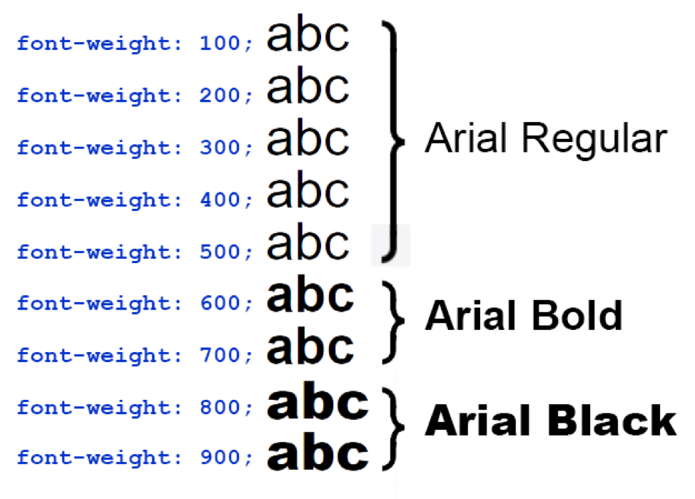
Image: Smart Way to Learn
Alignment
Here’s a problem: half of your slides are left-aligned, meaning that the elements are crowded along the left edge. The other half alternates between center-aligned and no alignment at all, which could be alright if it was deliberately designed that way.
But it wasn’t. And your audience will be able to tell.
Pick an alignment style and stick with it. Left, right, center, or none: create continuity — and hierarchy — by placing your elements in a way that makes sense.
Grouping
Grouping is a key visual way to create hierarchy and tell a story that makes sense by creating “clusters” of information.
In the case of your slide deck for your pitch, for instance, you’ve created slides for branding and marketing.
But within each individual slide, the points are placed haphazardly, apparently at random.
Corralling your points and placing them together, perhaps in clusters of three, help to visually identify where each point belongs, and assign it importance.
Make A Motion
Most of us are easily distracted by motion. It took us three tries to type out that sentence, because there was a butterfly outside the window.
Make motion work for you as a visual hierarchy tool by:
• Including short video portions within your slide presentation
• Including changing color elements on important points
• Including an animation, such as the aforementioned pointing arrow
Rule of Thirds
The rule of thirds is a classic key in all sorts of design, and it’s a great way to create visual interest within your slides, as well as tell the viewer what they should be focusing on.
Break your slide up into a grid with three horizontal and three vertical lines. Then place the points of special interest at the intersections.
Creating the Pitch of Your Dreams
It is now just after one in the morning on Wednesday, the day of your appointment to pitch your idea to the people with the money. You page through your edited slide deck one last time, and sit back with a sigh of relief.
You did it. Your slide deck is now stunning.
We’re not sure why you procrastinated this long, but that’s beside the point. The upshot is, using these ten rules of visual hierarchy, you have created a presentation that will
• Deliver information accurately
• Entertain and educate
• Hit the high points in an obvious way
And perhaps most importantly — keep your investors awake all the way through till the end.
Now all you have to do is get in there and sell it!
~~
Guest Blog Post Author
Alicia Rother is a freelance content strategist who works with small businesses and startups to boost their brand reach through creative content design and write-ups. You can connect with her here.
~~
Main Photo by Product School on Unsplash